UI/UX design is often judged by how it looks.
In reality, it should be judged by how well it guides decisions.
A beautiful interface that doesn’t help users understand what to do is not good design.
It’s decoration.
Design becomes effective only when it reduces uncertainty, clarifies intent, and makes choices feel obvious. Everything else is secondary.
The problem with “beautiful interfaces”
Many interfaces look impressive and still fail.
They win awards, collect likes, and look great in presentations — yet users hesitate, get lost, or abandon the flow altogether.
Why?
Because beauty without direction creates friction.
Common symptoms of aesthetic-first design:
- Everything looks important, so nothing stands out
- Visual effects compete with the message
- Layouts feel dynamic but don’t guide action
- Users admire the interface instead of using it
When visual appeal becomes the main goal, usability quietly disappears.
Good UI/UX doesn’t try to impress.
It tries to communicate.
Design decisions happen before visuals
Before colors, before typography, before components, real design work already happened.
Or at least, it should have.
UI/UX decisions start with questions like:
- What problem is this page solving?
- What decision does the user need to make here?
- What information is required to move forward?
- What can be removed without harming understanding?
If those questions don’t have clear answers, no amount of visual refinement will fix the result.
Visuals amplify decisions.
They don’t replace them.
Hierarchy is the real design skill
Hierarchy is the most underrated UI/UX skill.
Users don’t read interfaces.
They scan them.
Hierarchy tells users:
- Where to look first
- What matters most
- What can wait
- What action makes sense next
When hierarchy is weak, users are forced to guess. Guessing creates hesitation. Hesitation kills momentum.
Hierarchy is not just about font sizes.
It’s about relationships between elements.
Clear hierarchy means:
- One primary message per screen
- Supporting information grouped logically
- Secondary actions visually subordinated
- White space used intentionally, not decoratively
When hierarchy is right, users move naturally.
When it’s wrong, everything feels harder than it should.
UX writing is part of the interface, not an afterthought
Many teams treat copy as content that gets “added” after design.
That’s a mistake.
Words are interface elements.
Headlines, labels, buttons and microcopy all shape how users understand the system. When copy is unclear, no visual treatment can save it.
Bad UX writing looks like this:
- Clever headlines that avoid saying what the product actually does
- Button labels that are generic or vague
- Explanatory text that appears too late
- Jargon that assumes insider knowledge
Good UX writing:
- Reduces cognitive load
- Clarifies intent
- Sets expectations
- Reinforces hierarchy
Design without language is incomplete.
Language without structure is ineffective.
When visuals help (and when they hurt)
Visuals are powerful — when they support the message.
They hurt when they compete with it.
Visuals help when they:
- Reinforce hierarchy
- Draw attention to key actions
- Create rhythm and flow
- Reduce the need for explanation
Visuals hurt when they:
- Distract from primary actions
- Add noise without meaning
- Break consistency
- Prioritize novelty over clarity
A common mistake is using visuals to compensate for weak structure.
That never works.
If the layout doesn’t make sense in grayscale, it won’t make sense with gradients and animations either.
Designing for understanding, not applause
Many interfaces are designed for other designers.
They optimize for:
- originality
- trend alignment
- visual complexity
Users don’t care about trends.
They care about understanding.
Designing for understanding means accepting that:
- The simplest solution is often the best one
- Removing elements is a design decision
- Familiar patterns are not a failure
- Consistency beats novelty
Interfaces that work well often look obvious in hindsight.
That’s not a weakness.
That’s the point.
Why decision-focused design converts better
Conversion is not persuasion.
It’s resolution.
Users convert when:
- They understand what’s being offered
- They know it’s relevant to them
- They feel confident moving forward
Decision-focused UI/UX reduces:
- Doubt
- Friction
- Cognitive effort
This is why clarity-driven interfaces often outperform more “creative” ones. They don’t demand attention. They earn trust.
When users feel guided instead of pushed, conversion becomes a natural step.
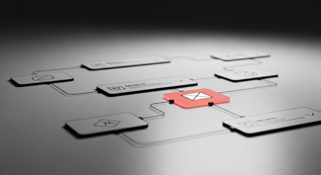
UI/UX as a system, not a screen
Designing individual screens without considering the system is another common failure point.
UI/UX doesn’t live in isolation.
It lives in flows.
Good design considers:
- Entry points
- Transitions between pages
- How information accumulates
- How decisions build on previous ones
When each screen is treated as a standalone canvas, the experience breaks.
Systems scale.
Screens don’t.
The role of restraint in good design
Restraint is a design skill.
Knowing when not to add something is harder than adding it.
Restraint shows up in:
- Limited color usage
- Controlled typography
- Purposeful spacing
- Fewer but clearer options
Restraint creates focus.
Focus creates movement.
Without restraint, interfaces become exhausting.
Final thought
UI/UX design is not about making things look good.
It’s about helping people decide without friction.
Aesthetic quality matters — but only after structure, hierarchy and clarity are in place.
Good interfaces don’t call attention to themselves.
They disappear behind the user’s progress.
And that’s what real design looks like.
Related topics
- Structure-first UI/UX design
- SEO built on information hierarchy
- Conversion driven by clarity, not persuasion
