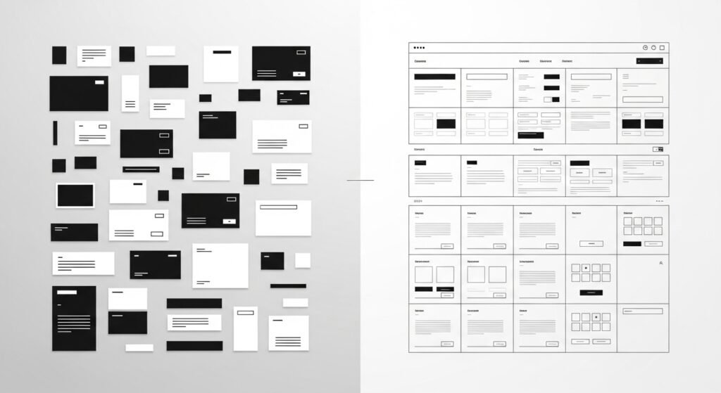
They fail because too many decisions get made in isolation.
Design teams chase originality. SEO teams chase visibility. Marketing teams chase persuasion. Each discipline optimizes for its own goals — and the website breaks in the gaps between them. This isn’t a skill problem. It’s a coordination problem, and it’s the reason so many websites feel loud, confusing, and ineffective despite being built by genuinely competent people.
The Myth of “Good Enough” Execution
Most websites aren’t badly executed. They’re locally optimized. Each part works fine on its own:
- The design looks polished.
- The content is well written.
- The SEO checklist is complete.
And yet the system as a whole doesn’t work. Users don’t experience a website as a stack of separate layers — they experience it as a single flow. When that flow is fragmented, users stall, even if every individual piece was built with care.
This is why clarity outperforms individual excellence, a point explored further in Clarity beats creativity: why most websites fail. A site can be creative, technically optimized, and persuasively written — and still fail — if those three qualities were never built to align.
When Creativity Becomes Noise
Creativity isn’t the problem. Unconstrained creativity is.
Too many interfaces prioritize being interesting over being understandable. They tease instead of explain. They animate instead of guide. They reward novelty over predictability — and the result is visual noise. Noise increases cognitive load. Cognitive load slows decisions. Slow decisions kill conversion.
This is the core argument behind UI/UX design is about decisions, not aesthetics: design choices aren’t artistic preferences. They’re behavioral constraints, whether a team treats them that way or not.
SEO Suffers From the Same Fragmentation
SEO is often treated as a layer bolted on after the design and content decisions are already locked in. Keywords get inserted. Metadata gets optimized. Technical issues get patched. But the core problem stays exactly where it was: the page still doesn’t explain itself.
Search engines don’t reward pages that merely contain information. They reward pages that resolve intent — the same idea covered in SEO is about being understood, not ranking. When meaning is unclear to a human reader, it eventually becomes unclear to the search engine reading the same signals.
Persuasion Without Clarity Creates Resistance
Marketing often tries to compensate for structural confusion with stronger persuasion: more urgency, more benefits, more emotional triggers. But persuasion applied too early reads as manipulation rather than conviction.
Users don’t resist because they’re skeptical. They resist because they’re disoriented. This is the argument at the center of Conversion happens before persuasion: clarity prepares the ground, and persuasion only works once that context is already in place.
The Real Problem: Decisions Made in Silos
Most websites are built through handoffs — design to content, content to SEO, SEO to marketing. Each step inherits constraints it never chose. Each team optimizes for its own piece. No one owns the system as a whole.
The outcome is predictable:
- Pages that look good but don’t explain themselves
- Content that ranks but doesn’t convert
- Copy that persuades without the context to support it
Users, of course, don’t know or care which team made which decision. They only feel the friction that decision left behind.
What Actually Works: Structural Thinking
Websites that perform consistently share one trait: structure comes first — before visuals, before keywords, before persuasion.
Structure is what answers the questions a user is really asking, whether they’d phrase it this way or not:
- What is this?
- Who is it for?
- How does it work?
- What happens next?
Everything else — visuals, copy, keywords — exists to support those answers. Seen this way, design, SEO, and copywriting stop being separate disciplines and become different expressions of the same structural problem.
Why Trends Keep Failing in Real Projects
Trends optimize for screenshots, not systems. They perform well in isolation — a landing page, a showcase, a portfolio piece — but tend to break once exposed to real content, real constraints, and real users.
Good systems age well. Trends expire quickly. That’s the practical reason editorial clarity outperforms visual novelty over time: clarity doesn’t need to be refreshed every season to keep working.
Final Thought: Websites Fail Between Disciplines
Most websites don’t fail because the people building them don’t know what they’re doing. They fail because no one is responsible for how the decisions connect to one another.
Clarity isn’t a deliverable. It’s an outcome of alignment. When structure leads, everything else tends to fall into place on its own:
- SEO becomes interpretable.
- UI/UX becomes invisible, in the best sense.
- Conversion becomes natural rather than forced.
Until that alignment exists, websites will keep looking good — and quietly underperforming.
Related reading
Conversion is clarity, not persuasion
UI/UX design is about decisions, not aesthetics
SEO for designers: structure before keywords