Most websites treat conversion as a moment.
A click.
A button.
A decision at the end of the page.
That’s why most conversion strategies fail.
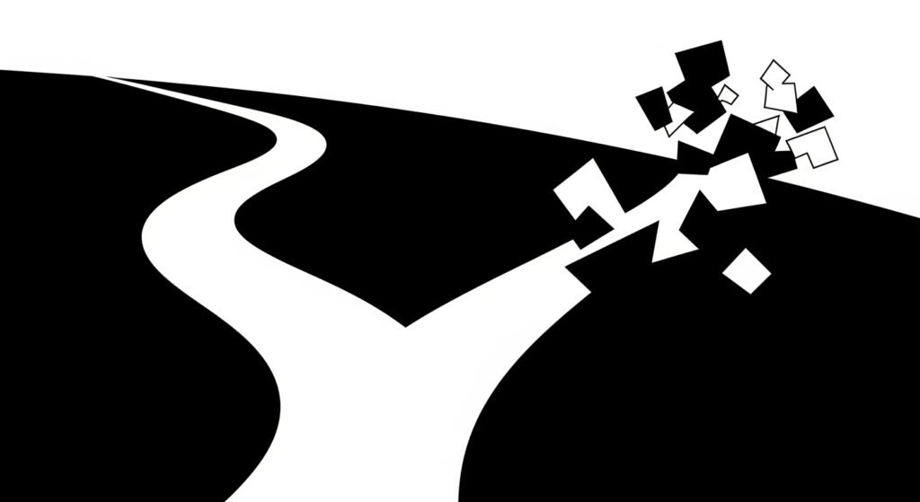
Conversion is not an event.
It’s a process of understanding.
Long before users decide to click, they are already deciding whether they trust you, understand you, and feel oriented enough to continue. By the time they reach a CTA, the outcome is usually sealed.
This article explains why conversion happens before persuasion, how clarity shapes decisions, and why UI/UX, SEO and copy are solving the same problem from different angles.
The biggest misconception about conversion
When conversion rates drop, the usual suspects appear:
- The CTA isn’t strong enough
- The copy needs to be more persuasive
- The offer needs urgency
- The button color needs testing
These are not useless tactics — but they’re rarely the root cause.
Most conversion problems happen upstream, before persuasion even starts.
Users don’t convert when they don’t understand:
- what a page is about
- who it’s for
- what problem it solves
- what happens next
This is why
conversion is clarity, not persuasion
Persuasion only works once understanding is already in place.
Decisions are made before users feel them
Users rarely feel the moment they decide not to convert.
They simply stop moving.
This happens at micro-levels:
- A headline that sounds clever but says nothing
- A section that mixes multiple ideas
- A layout that doesn’t guide the eye
- A form that appears too early or too late
Each of these moments creates hesitation. And hesitation kills momentum.
This is where conversion intersects directly with
UI/UX decision-making
Good conversion-focused design reduces the number of decisions users have to make — not by hiding information, but by structuring it.
Clarity is what removes friction
Friction is rarely dramatic.
It’s subtle.
It looks like:
- re-reading a sentence
- scrolling back up
- hovering without clicking
- abandoning without frustration
Clarity removes friction by answering questions before users ask them.
That’s why conversion optimization is not a copy problem alone. It’s a structural problem.
The same structure that helps users understand also helps search engines interpret meaning — which is why conversion and SEO are connected at the foundation.
As explained in
SEO is about being understood, not ranking
If meaning isn’t clear, neither users nor search engines move forward.
Persuasion without context creates resistance
Persuasive copy assumes readiness.
But many websites try to persuade users who are not yet oriented.
They push benefits before explaining relevance.
They push urgency before establishing trust.
They push CTAs before creating clarity.
The result is resistance.
Users don’t feel convinced — they feel pressured.
This is why high-converting pages often feel calm.
They don’t rush users. They guide them.
This principle mirrors what happens in good interfaces, where usability disappears when it works.
Good UI/UX is invisible — until it fails
Conversion works the same way.
Conversion is a structural outcome
Conversion doesn’t come from tricks.
It comes from alignment.
Alignment between:
- message and intent
- structure and flow
- promise and delivery
This is why treating design, SEO and copy as separate silos breaks conversion.
- SEO brings users in
- UI/UX helps them orient
- Copy helps them decide
When any of these breaks, conversion collapses — regardless of traffic.
This is also why
clarity beats creativity
in real-world conversion scenarios.
Creativity without clarity increases cognitive cost.
And cognitive cost reduces action.
What conversion-focused clarity looks like in practice
Clarity-driven conversion shows up in decisions like:
- Headlines that explain value, not tease curiosity
- Sections that answer one question at a time
- Visual hierarchy that makes scanning effortless
- Copy that guides instead of persuades
- CTAs that feel like the obvious next step
None of this feels aggressive.
All of it feels intentional.
This is where conversion becomes a natural outcome — not something you force with tactics.
Why most CRO advice plateaus
Traditional CRO focuses on optimization after structure is set.
But if the structure is wrong, optimization plateaus quickly.
You can test:
- button colors
- microcopy
- layouts
But if users don’t understand the offer, no test wins long-term.
This is why sustainable conversion gains come from:
- rethinking page structure
- clarifying intent alignment
- simplifying decision paths
Not from endless experimentation on broken foundations.
Final thought: persuasion works only when clarity is done
Persuasion is not evil.
It’s just overrated.
When clarity is present:
- persuasion feels helpful
- decisions feel easy
- conversion feels natural
When clarity is missing:
- persuasion feels manipulative
- decisions feel risky
- users leave quietly
Conversion doesn’t start at the CTA.
It starts at understanding.
And understanding is a structural problem — solved through design, SEO and copy working as one system.
